Navigating free website maker tools: manager update 1
On 18/06/2010
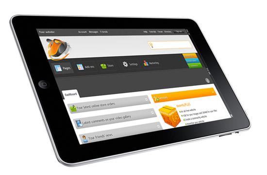
 As I mentioned yesterday, the doomby site manager is undergoing a pretty radical facelift at the moment, in order help you make a website easier than ever before. We also thought it was about time we brought the visual design of your site management and web page builder tools into line with the public doomby website design. Today, we'll take the first of our tours behind the scenes of your updated free website maker tools, to help you familiarize yourself with the new site layout.
First up: site navigation. As you can see from the screenshot below, your new website manager is radically different (visually) from the current interface. Yet once you've familiarized yourself with the main changes to the menu layout, you'll soon feel right at home.