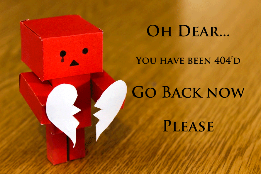
From time to time, a website's 404 error page is actually more interesting than the site itself. And occasionally, a website exists only as a way to display the creative efforts that have gone into creating it's 404 page. But it doesn't mean they're any less fun …
If you too are thinking of breaking with tradition, why not get inspired by thinking big, like the guys at 404.org?
Google Webmaster Tools could do with a serious injection of humor – if you have a super serious website, maybe you'd like to keep it simple and plain (but why would you, when you could make it fun!?).
Apple takes the same approach, but spices it up ever so slightly (though I kinda wish they'd illustrate it with the Ghandi photo ...).
I have a colleague at work (two, in fact) who'd really get more of a kick out of seeing this on your website than what they were actually looking for, and may indeed come back regularly just to see it again.
Camodesign has a vested interest in displaying what they're made of - the timely yet very retro Tron reference got me hooked. I dare you to pretend you're not interested in staying a while to read …
Why not let your website theme be the inspiration for the 404 page? Fotowork did, mixed it with a touch of humor, and came out with this.
Now, I just know that my mother will be rolling around laughing at this one, but then she's easily amused, and is singularly responsible for perpetuating the bane of our collective existence: the ha ha Powerpoint email. Having said that, you'll agree – I'm sure – that it does have a certain rustic charm, and is just risqué enough to pass the muster. She'd also get a thrill out of this, but that's just because she'd want the shoes. Please, do something similar, and make my mother's (and every other 60+ web-surfin' chick's) day.
Drawn as I am to the literary talents of others (not actually possessing any of my own), I'm rather partial to the musings of Plinko – and why not use poetry as a way of gently easing others into the idea of being desperately lost, beyond all hope?
For a dude with a very unattractively designed website (didn't that kind of thing get banned in … 1997?), Hank sure has a way with 404s – I'll put it down to his acute sense of humor. If you too have an otherwise well-disguised knack for the quirky, you could do a lot worse than to follow his example.
Same idea, but with retro imagery, makes for fun the whole family can enjoy (or at least anyone old enough to remember the 50s), and is bound to appeal to a large proportion of your visitors.
Personalizing your 404 error page is not only great for your website, but just one of the ways your free website builder makes it fun to make a website. If you haven't tried it yet, give it a go this weekend - and if you come up with a really creative 404 page, post it to us on our Facebook page and share it with everyone. What are you waiting for? Get inspired and get creative!
