Changing leaves

3 quick changes to make for a better website

On 15/11/2016

In Website design

Sometimes the simplest detail can make or break a website. With these simple three changes you can make your website look more professional.

Add a favicon

Make your webpage stand out by differentiating your website in a browser address bar, tab, or bookmarks list. Show a strong brand identity for your website with a simple image or a simplified version of your logo. This has become standard practice, look up at your address bar and you will see a plethora of favicons that make your site easily recognizable.

Bar

Add a favicon to ensure that your site already has a professional look from it's first open. Don't wait to create your image from your favorite photo editor! Just create an image in gif, jpg, or png with the dimensions of 16 x 16 or 32 x 32 pixels.

You want to make your favicon representative of your website. Choose the name of your website or brand, or even just a letter if the name is too long. Choose strong contrasting colors for good readability, that respect to your site's visual identity of your website activities. The goal is that your website stands out among the other tabs that are open.

Harmonize your website colors with your logo

Adding a logo is highly recommended to create a true visual identity. However, the colors in the logo must integrate perfectly with the colors of your website, especially in the header. This is an important factor to creating a professional look. Yet if you are wondering how to do this is more detail. It is simple.

Using the pipette tool on your favorite photo editing software will allow you to retrieve the color codes of your logo and establish a palette of colors to use on your website.
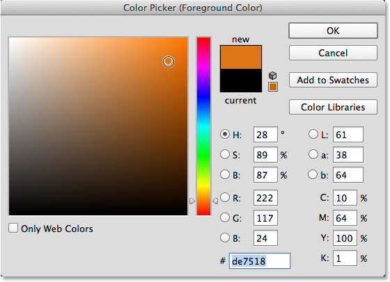
Ps color picker

Depending on the software used, the codes can be shown in different values (in hex, for example, with a code starting with the sign #). This is the code to be used on the manager in Settings > Design (codes in RGBA with 4 values separated by commas ). You can convert almost all color codes easily using tools like Color Hexa or Color Picking Tool.

Once you know the colors and the code present in your logo, you will want to use these in your website design template. You can integrate the colors as a highlight element, or for the side menus, or as a link color. The possibilities are endless with the easy personalizable design form.

Not very good at associating colors? Don't worry, you are one of many. There are tools online perfected to choosing colors. Consider looking around at Color Hunt with color palettes that work well together, or these website color schemes or if you want to try your hand at choosing colors using tools like Paletton. In any case, I recommend you limit the number of colors on your site to 2 or 3 different tones to avoid the rainbow effect.

Create clear blocks and columns on your homepage

Organize content in clear and separated blocks will help to make reading easier and pleasant on your website. Thanks to the block and column display, creating a clean page layout becomes child's play!

Several options are available, including the ability to add block or column separations for a modern and professional look (for example, this is the case with line separations between each of the three suggestions. To use this option, simply click on the Appearance button at the bottom right of each line and then select the desired style with the drop-down menu.

If you want to go further in the personalization of your rows or columns, it is also possible to use the highlight feature to integrate an effect on hover. Of course, this functionality is not limited to the homepage of your site but it is important to start on your homepage first. As your homepage is the page that will make you want, or not, to visit the rest of your website!

site perception optimization