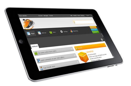
1. The top menu: account and community features
We've regrouped all the links related to you and your doomby account at the top (including your friends list, private messaging, and account details), with links to the forums, directory, tutorials and online help. The top menu now matches the one on the doomby website, ensuring you always have access to the same tools and options in the same place, whether you're working on your site content or posting on the doomby webmasters' forum.
2. Tip box: contextual help and links
No, you won't find it full of $1 bills at the end of the day, but you will find it full of useful and relevant tips and advice, related to whatever page you're currently working on. Keep an eye on the tip box for links to relevant webmaster tutorials, extra services, new features or advice. The content is constantly refreshed, and contextually-based, to ensure you always get access to the most relevant and useful information.
3. Main menu: site management and subscriber services
This is where most of the redesign work has been focused, reducing today's 9 menus down to just 4 (5 if you've enabled the e-commerce module to make a free online store part of your website). We had a long think about the best way to regroup the different site management functions, and have reorganized the existing elements to ensure you still have access to the same features, but in a less cluttered interface. Subscriber services have now been grouped to the right of the main menu, and with account and community services moved to the top, there's now a clear separation of these features from the rest of the site management menus.
With three distinct menu groups (account, site management, and subscriber services), it's going to be a lot easier to find what you need, fast. The existing Site menu has been replaced by the Marketing menu, which regroups all the marketing and communication tools related to your website. General site settings and preferences, including those from the existing Configuration menu, are now regrouped under the Settings menu.
4. Sub-menus
To access the various management features of each menu, just pass your pointer over it – we've redesigned the sub-menus to make them easier and quicker to navigate. Everyday management tasks are now even easier than ever before, making it even quicker to add a new web page, or upload photos to your photo album.
You'll notice from the Add-ons menu that we've radically reorganized the layout, meaning you'll only see the add-ons that you've enabled, whilst still making it a snap to enable other add-ons.
That's it for today, and for our first look at the new site manager. Keep an eye out over the next few days for a new post, introducing you to your new site dashboard: giving you an instant and detailed overview of your website and community updates.
If you like what you've seen today (tell us!), then just wait until you see what's in store for you in the weeks ahead. As I said last time, it's going to be … magical!
 As I mentioned yesterday, the doomby site manager is undergoing a pretty radical facelift at the moment, in order help you make a website easier than ever before. We also thought it was about time we brought the visual design of your site management and web page builder tools into line with the public doomby website design. Today, we'll take the first of our tours behind the scenes of your updated free website maker tools, to help you familiarize yourself with the new site layout.