Simple

It's now easier and prettier to make a website

On 12/03/2010

In New and updated features

I'm sure our millions of avid readers would have noticed my absence last week, and have probably been suffering in agony ever since. Sorry for that. But there was a very, very good reason, and as I am now back, you can all breathe a collective sigh of relief (and take down that Facebook vigil). For those of you who've dropped by your favorite free website builder in the last few days, you'll probably already have figured out why – for those who haven't, you soon will.

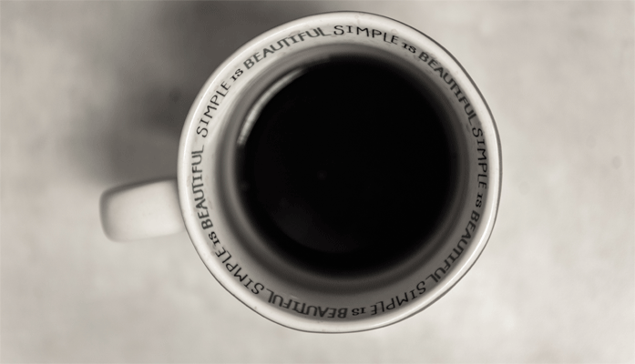
In any case, you'll probably all agree that after four months it was time for doomby to get a little dressed-up (inspired, no doubt, by this image from a few weeks back, to aim for bigger and better things) - both to encourage you to strive for webmastering excellence, and to create a website that rocks. So kudos to Pascal and Florian for some really fantastic work on getting the site up and looking great (I knew they had pretty genes in there somewhere ...).
There was – and is – another reason for the makeover, beyond the purely aesthetic. Aside from improvements to our site's external appearance, there was also a lot of work done under the hood to make the site quicker, more responsive, and easier to navigate. We've spent a lot of time optimizing the layout to get you in and around the site more easily, and to synthesize what doomby is all about on our e-commerce, free website, doombyPLUS - pro website, domain name and webmaster testimonials pages.

We've also taken advantage to overhaul the operation of our member website directory: both to rework it for your websites' SEO and to improve its speed. Our on-site support services – webmaster forum, webmaster help, and webmastering tutorials – have also been reworked to make them easier to use and to navigate.

Some of our members have also contributed to our site makeover - a big thanks goes out to all involved from the whole doomby team. You'll see what they have to say (and why they chose to create a website with doomby) right on our homepage, so don't hesitate to stop by their websites for a visit too - I know they'd be glad to say hi. If you'd like to participate as well, just drop us a line.

In spite of all this work, we're only at stage one of our site revamp. Over the coming months we'll be feverishly working behind the scenes on your site managers, to make them more user-friendly, quicker and streamlined (and, yes, we'll be making them prettier as well).

If you haven't checked out our new site pages this last week, stop by for a look. We hope you'll be as pleased with the result as we are – let us know what you think!